Floodwater engulfs them, fascists burn them, but printed matters are database-proof ㋡
A few hundred years have passed since metal, rubber, and trees (may they rest in peace) made knowledge more reproducible. Today, as audio, ebooks, and tiny mics proliferate, our intrigue in magazines and their microsized offspring persists. Is it glossy table adornments you’re chasing? DIY documentation that doesn’t take a charge? Maybe you cherish the scrawled poems inked into construction paper, the way its pulp tickles your fingers. There’s Condé Nast’s commercialized artifacts and there's self-published vessels. Smol containers of words, images, textures, distributed freely as revolutionary pamphlets among artists from Detroit to Mumbai. They sit beside Gildan shirts on merch tables and fall from the airborne bombers of occupiers, endure as mementos of Peruvian love stories or shrink and batch 80s rave posters to sell for the price of a week’s groceries in western capitals. Hua Hsu memorialized them well.
However you feel, whatever you think’s fit to print, bound physical media has proven itself time-resistant. Short-form’s digital reign has also enjoyed the fleeting company of bleached brows, temp henna, [untitled] demos, Radio Alhara broadcasts. Zines do both: ephemeral length, lasting material. Their larger brothers and sisters bring added weight.
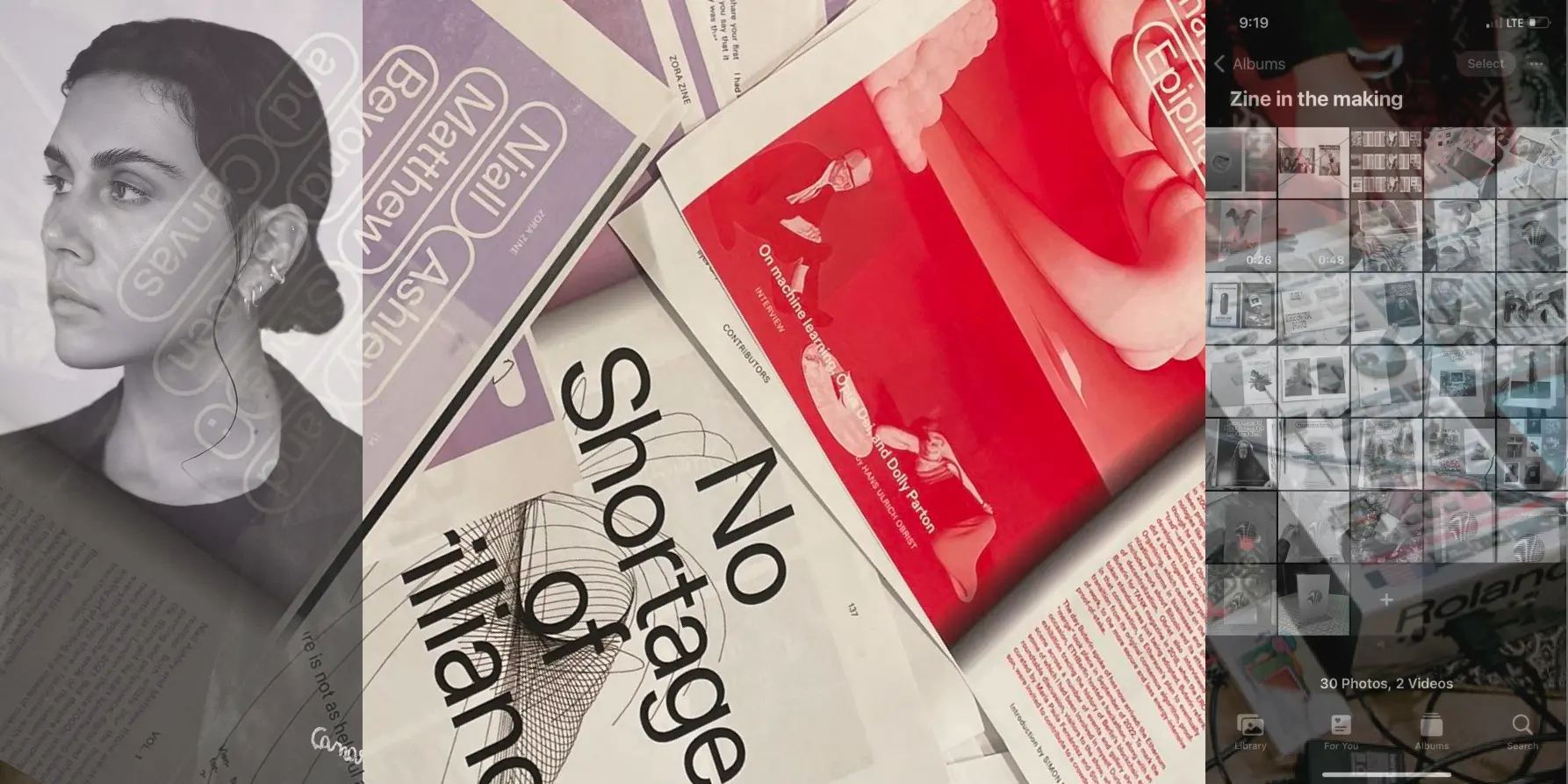
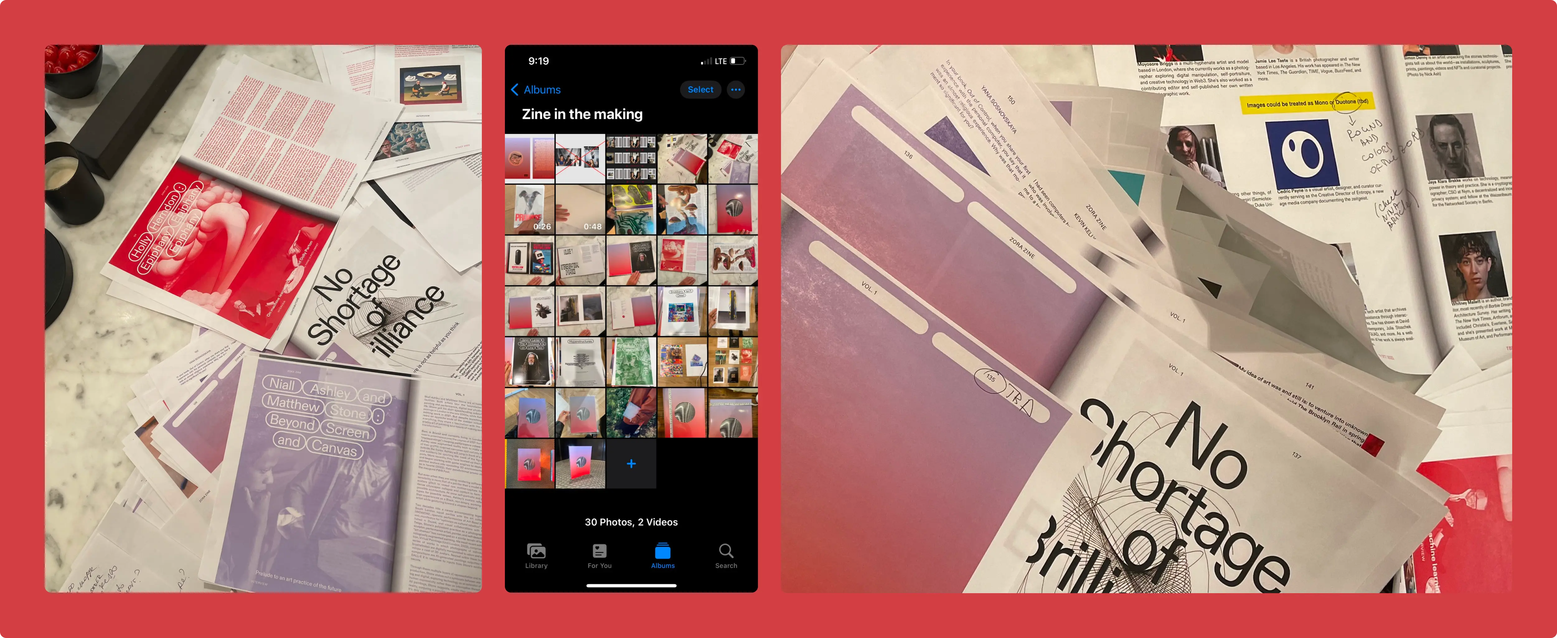
Earlier this year, Yana Sosnovskaya, who’s experimented with storytelling, fashion, and visual art for a living, worked with a devoted, multidisciplinary team on a standout magazine (aptly called Zine). The ambitious project, produced with Zora, bridges 3D modeling, long-form profile writing, critical cultural essays, striking mechanical hardware, old school manufacturing and new internet distribution-compensation tools.
“Zines are usually very small, anything from under 100 copies to 1000, and because of that it lends itself to DIY, relatively accessible self-publishing,” Sosnovskaya says. “Technically, in terms of cost and production, our project was a magazine, but we wanted to honor the spirit of that word and the radical nature of what it represents.”
As a group, the Zine team went for it, their collective effort lifting the ceiling of possibility a little bit higher. Whatever happens on the business side, projects like these — Zine, the acquisition-decimated Bandcamp Union, Ampled’s admirable (and retiring) cooperative, Nik Arthur’s one-of-one animations, SOKONG's photography books published in Yogyakarta — deserve acknowledgment: their impact rings out far beyond the profit line. Zines offer accessible, multiuse means of documenting and conjuring culture — resistance against music's leanback era of passive fandom. Magazines double down.
In the spirit of open source creation and the proliferation of ideas with integrity, Yana was kind enough to speak at length with us about the principles of zine-making and the process behind Zine itself. Wishing everyone out there working on their art godspeed, and a special shoutout to Yana's Zine team: Editor-In-Chief Liam Casey, Print Issue Editor Emilie Friedlander, Deputy Editor Guy Mackinnon-Little, Art Director Sergey Poydo, Print Issue Producer Ariel LeBeau, Zine Producer Corrine Ciani, Illustrator Mary Zet, Photo Editor Cameron Getty, and advisors Victoria Camblin and Nicholas Korody. With that, let's get to the rest of the story...

Yana's Zine Principles
- Ignore all rules: “This format, by nature, is experimental. The more daring you are when you come into creating your Zine, I think the better the outcome will be.”
- Pick a theme: “Zines are a very small format — often eight to 16 pages — so multiple themes can become overwhelming or risk shrouding your message.”
- Delegate collaboration: “You can do it all on your own, work directly with others who specialize or feel more passionate about certain mediums, or curate contributors.”
- Choose a format: “Paper size, page amounts, and paper type, which arguably dictates the physical experience more than anything, from really thick to really flimsy. You can achieve a level of ‘uniqueness’ or communicate certain feelings just by paper type. I’ve seen the majority of zines printed with matte paper, not glossy, likely because of the technical requirements of printers and risographs. Whatever you go with, it does help to give a little weight to something that’s otherwise so small.”
- Mind the binding: “Bleed is also an important factor to consider — not placing any page elements too close to the edges of the binding and stitching. Print tests early on.”
- Think about your reader: “Putting yourself in their shoes is always helpful, even if it’s just to subvert expectations. What they see first and where they end up is a journey you have complete influence over.”
- Decide your text approach: “It’s useful with printed matter to have a sense of the ratio between text and visual components for storytelling. Within larger magazines, especially in fashion, there are traditional sections, usually split in thirds. Zines are free of that.”
- Design how you see fit: “A zine can be hand-drawn, a collage, strictly predesigned with InDesign and Figma, or anything in between. Full of text, zero text, low fidelity, high fidelity.”
- Study your printer: “The technical specifications of your home printer, library printers, or the printer at a local or chain shop like Staples essentially tells you your options. You can use and play around with different paper types and textures within those constraints.”
- Attribute sources: “It’s less common with zines to have an exhaustive masthead that names all the collaborators involved, but I encourage everyone to credit someone whenever you use their work, quote them, etc. That’s part of the value of these projects.”
- Expect color surprises: “Professional printers use the CMYK color grading system, whereas digital uses RGB. Neon’s especially difficult to achieve and typically add cost. Often something looks vibrant onscreen but disappoints on paper.”
Printed Matters & IRL Permanence
Liner Notes: Why does printed matter matter to you?
Yana Sosnovskaya: It's a brilliant way to preserve information and create time capsules. I see it as comparable to the archival value of decentralized databases. If you deploy a non-upgradeable smart contract, or if you send something off to the printer, you can’t go back and change or adjust it.
LN: You live with your typos.
YS: It’s long-term by default, like sending someone a letter you wrote with a pen. So many of us also continue to crave physical experiences and objects that exist beyond digital use, which takes a different set of skills to produce. I was recently visiting San Francisco — you hear so much about how that city has lost itself culturally. It’s a beautiful place that still has so much potential. So many brilliant people remain there. But it’s full of people treating it like a transit zone who specialize at creating digital experiences, without much concern for the physical.
LN: I appreciate the dots connecting right now between printed matters and something as ‘macro’ as urban planning, public policy, and the mixed bag of privatized involvement. Buildings fall, vinyl vaults burn, but, as we’re increasingly seeing, so does the internet.
YS: Exactly. For a project as involved as Zine, it was critical to work with people who prioritize the physical, and that’s where the publisher Actual Source came into play. I’m a huge fan of their work, they’re phenomenal, and they held our hand from start to finish. There was only one moment of differing expectations between us, during the prototype phase, which is one that step is there for. At this stage, Actual Source creates an unbinded packet of paper, produced in-house, with no images and no text. It was extremely thick, heavy paper. Almost 200 milligrams, which is what you’d associate with a magazine cover, and our magazine is 250 pages. [Laughs] It was very hefty, so we had to reduce the thickness and weight.
LN: How did you and your team’s text-to-visual ratio affect paper choice?
YS: Initially, our prototype had matte paper, but because we knew we had so much photography planned for the debut issue, we opted for glossy, as matte doesn’t absorb the ink the right way. Within that, different types of matte paper respond differently. The second prototype was perfect — like, “Oh my God, this is it” — so we were able to move forward from there.
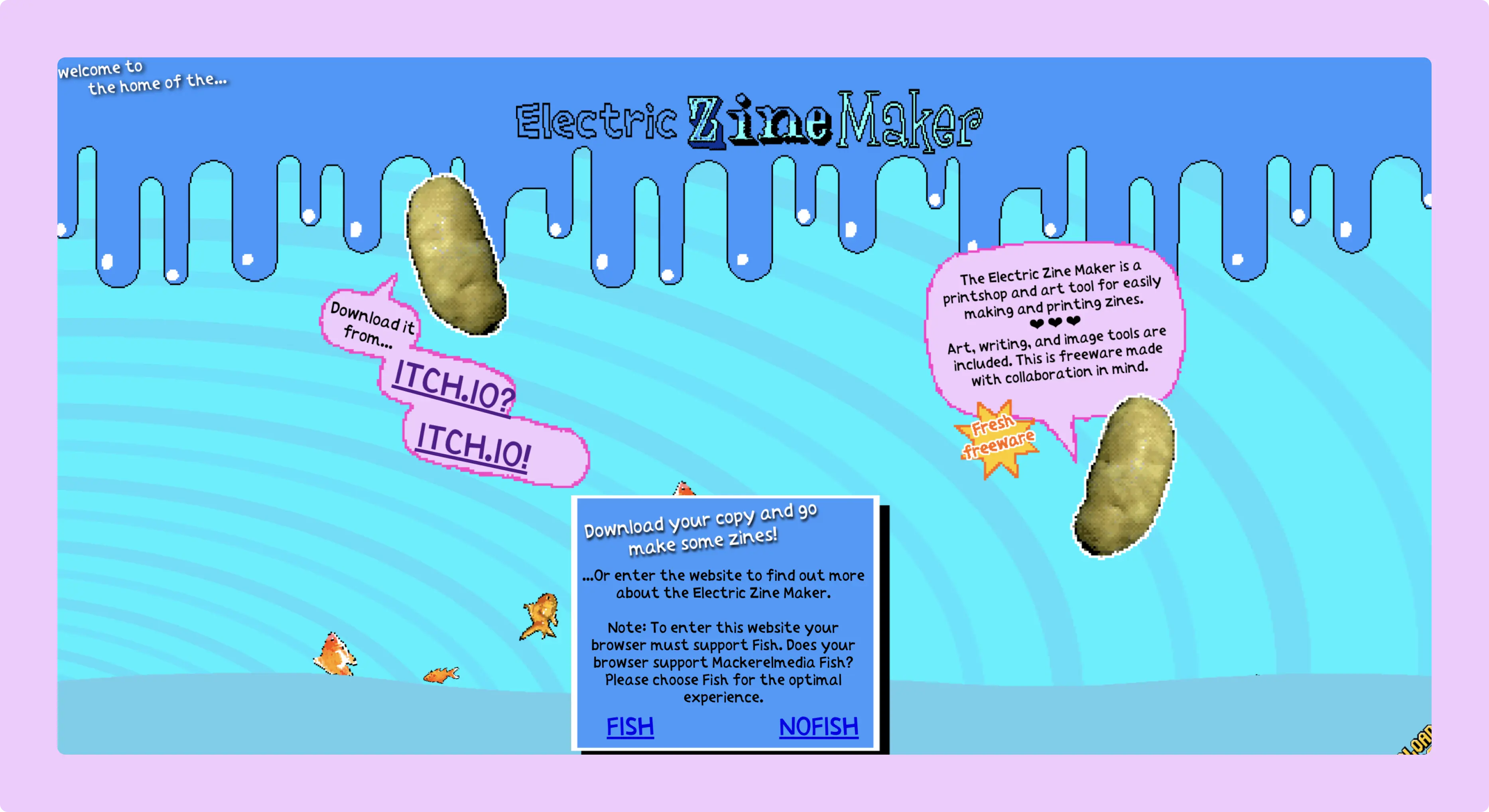
LN: Whether it’s stapling comics together on printer paper or using Electric Zine Maker or working with a renowned publishing house, special expression can result.
YS: Electric Zine Maker seems like a brilliant tool, just looking at some of the final work people were able to produce using this. Especially for someone who might not want to spend too much time trying to design their own zine structure from scratch.
LN: In which areas of production do you think technical knowledge makes a difference?
YS: Color in digital and color on paper are two different things and that's something to really remember. Black and white, especially printing at home, is the easiest decision. Different printer techniques exist for transferring color from digital to paper. Professional printers use the CMYK color grading system, whereas digital uses RGB. Neon’s especially difficult to achieve and typically add cost. Often something looks vibrant onscreen but disappoints on paper. When you send all the files over to the printer for production, they’re going to transfer them to the CMYK system. Bleed is also an important factor to consider — not placing any page elements too close to the edges of the binding and stitching, as it will hide certain elements.
LN: A little frustrating at best, affecting the readability of an entire zine at worst.
YS: I’ve made this mistake before. Do a color test with whatever printer you’re using to test the border and binding limits, and ask a printshop, if you’re working with one, how much space you need to leave for binding. You can do a mockup by hand, once you choose the size and thickness of paper you want to use. You don’t even need contents. Just number the pages, doodle if you want, and create something you can hold in your hand before investing in proper production and reproduction. Many copy machines use black and white, while risographs have the ability to play with color that leaves a very specific texture of ink. It’s a bit uneven. Some people like that, others don’t. Both local printing and at-home options are pretty accessible now. For binding, you can staple, glue, stitch, or spiral. Some people fold it, map style, using A2 or A3 paper, which lets you unveil some larger image. Maybe a poster.
LN: Coup De Main does the foldable method for their cover stories. They’ll print a massive poster of one artist, like Roy Blair, then configure a dedicated zine out of that giant page. I hope folks are still out there printing zines at libraries. I know schools like RISD maintain a dedicated library archive for zines; others offer zine-making guides. I had to run into a public library in London a few weeks ago and print like 24 pages. I think it was roughly $0.40 USD. On the other end, how did Actual Source get involved with Zine?
YS: To be honest, we just reached out of the blue. They’re meticulous and curatorial themselves. The conversation we had was around delegation. Our team would maintain art direction and trust them with print design, which we had minimal experience in. To preserve dialogue between our digital publication and print, we gave them a couple fonts, feelings, design elements. After the prototype phase we discussed earlier, there’s a couple rounds of Actual Source presenting their ideas, which were always abundant and amazing. I’d ask, “So, why can’t we do this?” And they’d say, “Well, if we do that, it’ll lead to this bad end result.” [Laughs] Constant learning.
LN: Was there a particular vision that got challenged by constraints?
YS: At some point, we all decided on a lenticular spine as a must-have for our printed matter. It reads “Zora” or “Zine” depending on how the light hits. We loved this idea. Obsessed. [Laughs] Any form of additional customization of course ends up costing a lot, though it depends on your volume. If you’re producing a batch of 100 or 200 books, maybe you pay $20 extra for a certain feature. If you’re producing 2500 copies, as we did, even 10 cents a book adds up. Actual Source works with a vast network of production houses — I believe our magazine was printed in Spain. They’d chat back and forth on pricing. It’s very similar to apparel production, which I know well from my background in fashion. The higher the volume, the lower the per-unit cost. We have the magazine cover cutout, zine inserts within the magazine, a little sheet of tab papers for the tongue, which is an homage to an out-of-home campaign we did. We included a poster with the late Herbert W. Franke, one of the originators and creators of generative computer art, who sadly passed away last summer. All of these things drove up the unit cost.
LN: Worth it.
YS: [Laughs]
LN: Rest in peace to Herbert Franke though. Truly a giant.
YS: That was his final interview, conducted by Tyler Hobbs. His widow was one of the first people to receive Zine, we sent one to her to ensure she had that homage to her husband’s legacy. She’s the sweetest. His work is on the cover, too. We knew we wanted his interview to be the cover story, but once he passed away, it became that much more clear. It’s a memento to him.
LN: Thank you for that backstory. Another layer of the intent and care behind the project.
YS: It was possible because so many people, with such distinct expertise, all aimed for the same standard. I’m the public-facing speaker from the team, but the number of brilliant producers, illustrators, editors, writers, designers — it was incredible to come together. We had more than 60 contributors all in. Whenever you have a project of that size, there’s frustrations. Locked interviews end up dropping out, film rolls vanish, opinions on a photoshoot clash for a moment. But you stick out those lows and the highs are overwhelmingly high.
LN: Beautiful ghosts rise from the idea graveyard. How did you approach compensation?
YS: We tried a hybrid model with payments. We didn’t want to solely rely on collector revenue to pay collaborators for their time and talent, and we were fortunate enough to be able to do both. I’ve talked to so many journalists or photographers who work in the editorial industry, in the media. Fair, quick compensation is a pain point for most of them. When editorial projects have a big name, they’ll tell contributors it’s good for their portfolio, and use that to pay less or nothing at all. Our whole team had an editorial background, so we made the philosophical decision early on to avoid that practice, whether it was paying the artists who created the fake ads in Zine or the writers of the stories. There’s specific circumstances that affect how we think about monetization. Once Herbert Franke passed away, Tyler Hobbs wanted that cover story freely available to everyone. We want to monetize the physical magazine itself, but we made the decision to make all the articles free to mint, which was awesome.
LN: I think it’s important to state the obvious, which is that, even when companies or institutions do have the resources to pay people better, they rarely choose to. Whether its paying double-digit scraps to writers for stories or continuing the lopsided artist-label splits that still exist far and wide. Did you establish a floor for contributor payments?
YS: We had a rate of $1 per word for Zine stories. Yes, it can incentivize a writer to prioritize word count over substance, a topic, line-by-line text choices, but we stuck with it.
LN: It still blows my mind, 10 years into getting paid to write, that the per-word model was commonplace and often generous, at least by today’s standards. I think most writers wouldn’t compromise their own integrity, nor risk leaving a bad impression on an editor, just to milk some extra money via run-on sentences, as tough as these times have been. What were the splits?
YS: We did 80/20, in favor of the artists, for the designers who worked on the 22 fake ads. That sort of split, frankly, wasn’t sustainable for us financially, in the long term. The goal, though, isn’t to make this cultural object into a profit machine, but to hit net zero monetarily. Cover our costs. Keep people fairly compensated. The mint cost to collect a copy of Zine otherwise went to Zora, to cover the cost of production, as all the other collaborators got paid for their work beforehand.
LN: Zora financially facilitated Zine and Club Chess in London, as Catalog financially facilitates Liner Notes, as Bandcamp financially facilitates, now to a lesser extent, Daily. The idea that so many cultural works rely on benevolent companies that believe, cynically or sincerely, in their brand value, leaves me perpetually on edge. Do you have faith that the relationship between culture and commerce will continue?
YS: Just speaking from my own perspective, not for the companies I’ve worked with, I think people or projects willing to invest in culture should understand that expectations of traditional financial return are misguided. They should have very clear reasoning for why they invest in printed matters, cultural works, and value those efforts on a deep, deep level. When those values are forged, or compromised, that’s when conflict arises.
LN: “Show me the money” can sometimes create a square peg, round hold situation.
YS: Historically, the financing of culture has succeeded when people did it out of cultural interest. If you look at the patronage from the 20th century, how the expressionist wave was started with the help of the Guggenheim’s and Gettys in America, countless patrons in Europe, in Russia.
LN: Even the CIA!
YS: I think if you’re having any sort of second desires, hidden intentions, for financing culture, you might not achieve your desired outcome. That’s how you avoid artists and cultural producers doing their best work.
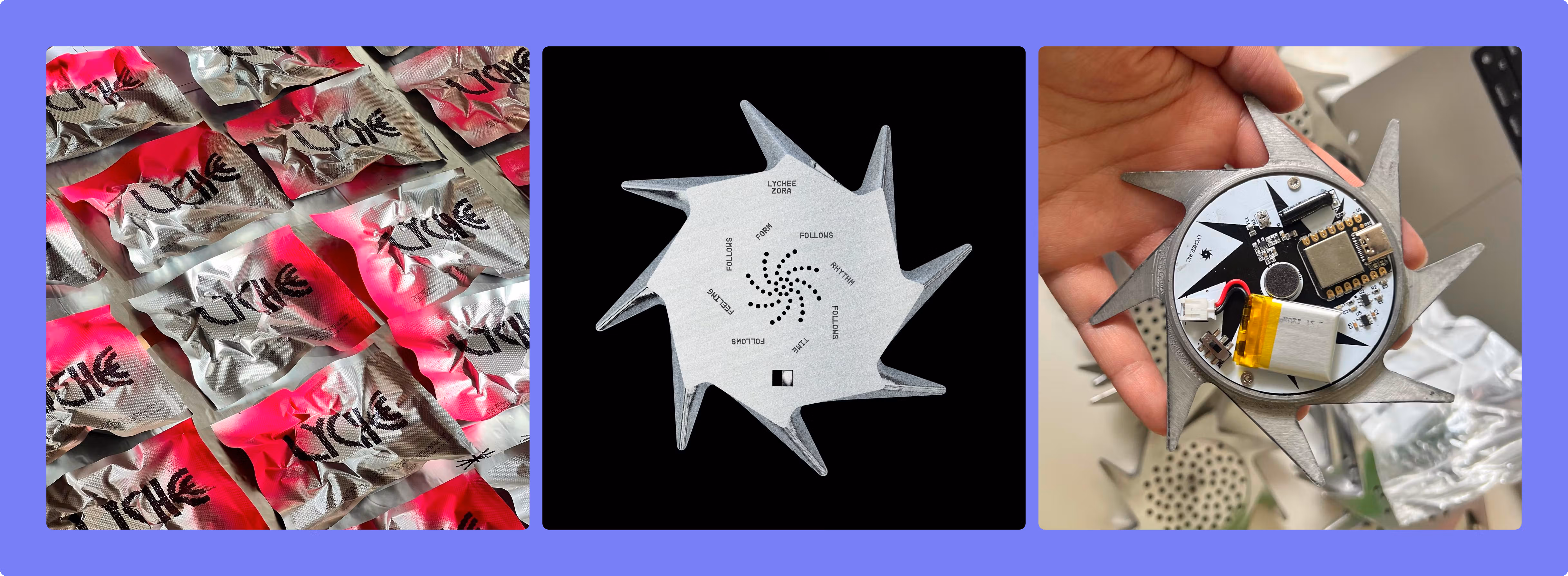
LN: I’m not sure how else you get something as magical as the LYCHEE device that shipped with a randomized batch of Zine copies. How did you first meet its co-creators, Tigris Li and Eugene Angelo?
YS: I think I met Eugene soon after I first joined this space. We spoke for a few hours at a cafe in Paris, then he came back to New York with Tigris and I realized right away the scale of their talent. They both take how they speak about their work very seriously, but what I can say is they are constantly producing and experimenting with new ideas. I think that device was playful by design. Not overthought. We sent one to each contributor on the project, including Holly Herndon, who had her baby earlier this year. Holly told us her baby loves it, and we were so concerned because of the pointed edges. [Laughs] I know Holly’s on top of it though. It’s probably a fascinating object for a baby to set their eyes on.
LN: Early life imagination expander. They're brilliant. When you set out to start Zine, did you have influences from your upbringing in Moscow in mind? Projects like Ptyuch or WAM?
YS: No, but wow. With Ptyuch, I was on the younger end of the audience spectrum, but I can vividly remember entering my teenage era, looking at older, cooler girls and boys who were reading Ptyuch, going to raves, wearing dark blue lipstick and pink nails. Like, “That is who I’m going to be when I grow up.” Ptyuch was very radical underground, a full blown magazine. Their editor-in-chief was a visionary, like the Jefferson Hack [cofounder of DAZED] of Russia. A couple references that do come to mind — one of my friends, Roman Mazurenko, who passed away in 2015, started a digital zine called LAM, along with the creator of LOT (fka LOT2046) Vadik Marmeladov, a well-known product designer. It was pretty niche, but quite renowned within specific cultural communities across Europe. Completely self-funded and self-produced. My partner was also on the editorial team with DAZED Russia and worked on the first issue, which they completed right before the economic crisis forced them to move back out of the Russian market. Jefferson Hack taught my partner a lot about working with editorial, and that influenced me.

LN: Rest in peace to Roman. It’s devastating but also critical to recognize how printed matters can help sustain someone’s presence after they’ve passed. Do you have hope for printed matters moving forward?
YS: Many of them are struggling. Actual Source produces amazing work. I’m a massive fan of 032c. I think Spike Art is doing a great job with print. System is amazing for fashion. But honestly, the best thing to do is go to your nearest book fair or record store and find the local zines on display. It’s also an incredible way to meet future collaborators, designers, and publishers. I recently went to Artbook store in MOMA PS1 and got this book containing essays about publishing as a practice. It’s the best way. Real life, rather than scouring online. Real life.